Other posts about The Source
- Project page
- The Source page on gm.studio
- The story behind The Source
- The Source Contest 🚀
- The Source: Building process from start to finish
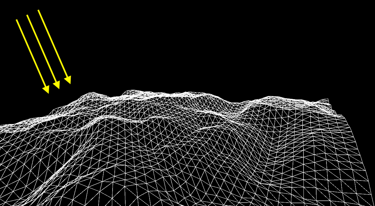
Paper is in 3D
In "The Source", we aimed to create a realistic and tactile paper texture. To achieve this, we used value noise to generate a 3D surface, simulating the physicality of real paper.
To calculate how light would interact with our digital paper, we used a dot product between the surface orientation vector, or 'normal', and the light vector. This allowed us to realistically model how light falls and reflects off the paper's surface, adding depth to our creation.
We want to give a big thanks to Piter Pasma for his valuable advice on this technique!

Keeping Pencil Lines Consistent in Warped Domains
In "The Source", we implement a technique known as domain warping. We define a grid based on Signed Distance Functions (SDF), and we apply domain warping to it. This process creates deformations that disrupt the uniformity of distances, causing a line of a certain thickness to appear differently across space.
We desired this variation in line thickness when working with Black ink, as it contributes to an organic, hand-drawn feel. However, to maintain realism when simulating pencil on paper, it was essential to keep the thickness of the pencil line constant.
To manage this, Inigo Quilez's article on distance estimations was a great help. It enabled us to locally calculate the derivative of the warp-induced deformations, allowing us to adjust and maintain the thickness of the pencil line.
Below is an example illustrating several techniques that correct the distances:
 Inigo Quilez
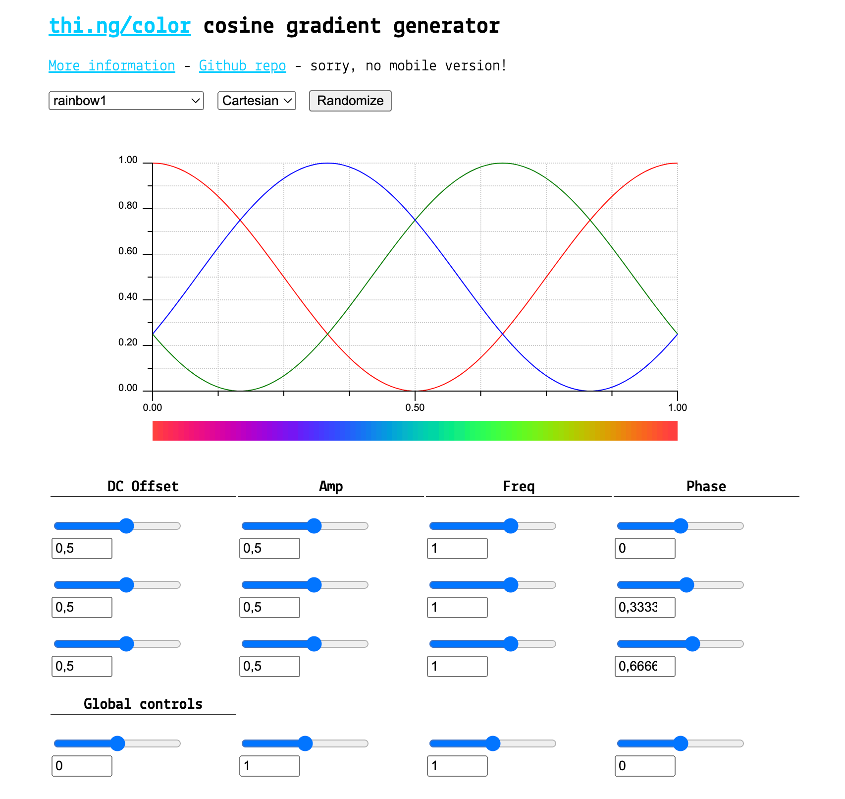
Using Cosines to Craft Our Color Palettes
To craft the color palettes for "The Source", we implemented a technique highlighted in Inigo Quilez's blog post titled "Palettes".
This approach enables us to define complex palettes using only four 3-dimensional vectors (vec3). It's a powerful tool that not only reduces the amount of code we write but also helps create smooth, aesthetically pleasing gradients.
However, the trade-off is that this technique is not as straightforward to manipulate as traditional color settings. Rather than adjusting the hue, saturation, or brightness of a color and its position within the gradient, we find ourselves manipulating the frequency, phase, and so forth of the red, green, or blue channels across the entire palette. This process requires a different way of thinking about color, but the results speak for themselves.
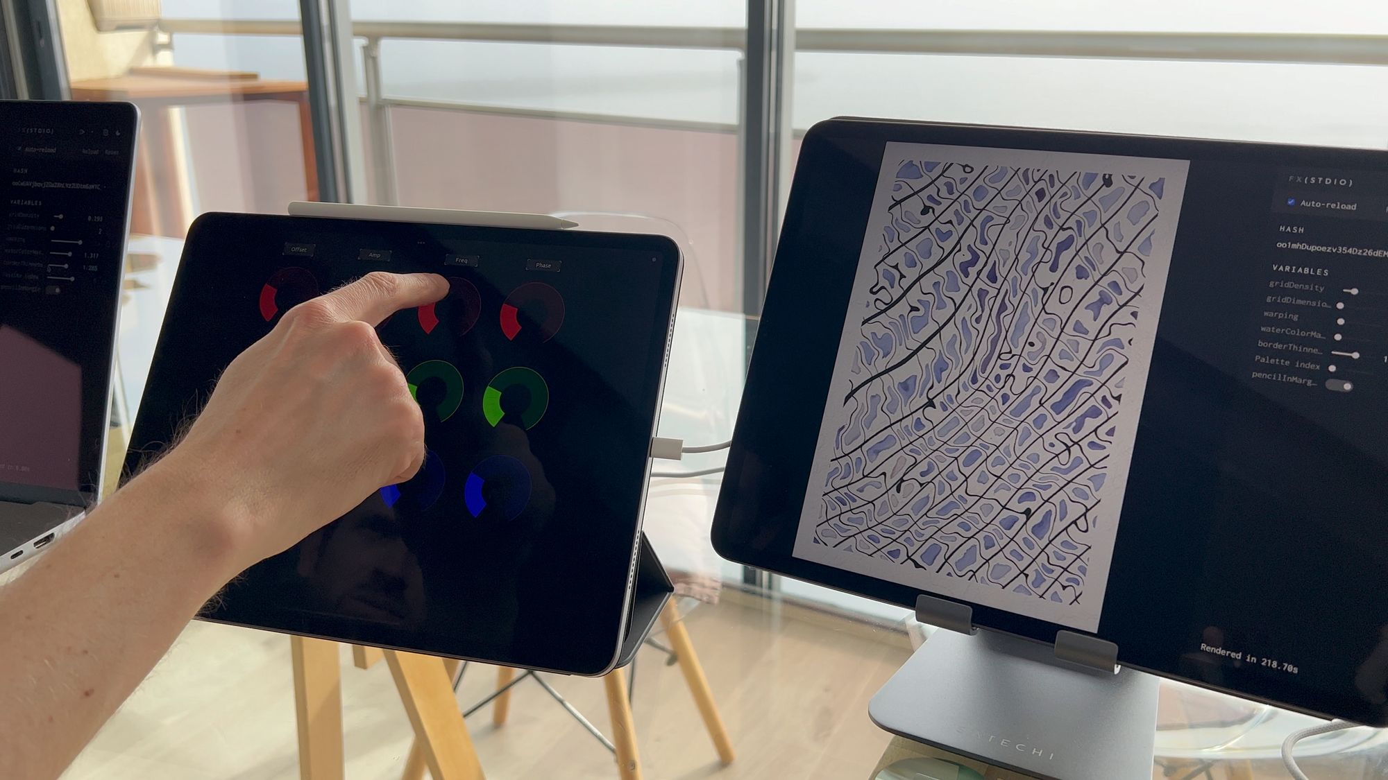
Easing Palette Creation with MIDI
Making our color palettes was made easier with the help of MIDI. Using an iPad, we could play around with the color values in our palettes in a hands-on way.
We used TouchOSC, an app on the iPad, to send these color values via MIDI straight to our JavaScript generator. This method gave us a more direct and creative way to make and tweak our color schemes.
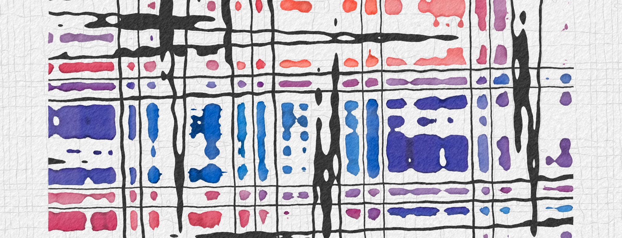
SDF-Powered Watercolor Animations
Each edition of 'The Source' is based on a grid that we distort. We describe this grid in the form of Signed Distance Functions (SDF), which lets us know the distance to the closest edge. Depending on this distance, our algorithm draws different textures. For instance, in a simplified way:
- From 0 to 0.1: Chinese ink
- From 0.1 to 0.25: the paper
- From 0.25 to 0.3: the watercolor border
- From 0.3 onwards: the watercolor
Once we had this system in place, we simply varied the distance at which we start drawing the watercolor to create an engaging animation. The flexibility provided by SDFs really allowed us to bring our watercolor vision to life.
Our watercolor shader is so fast that I can animate it 🔥
— Camille Roux - Generative artist (@camillerouxart) November 30, 2022
What do you think about ? pic.twitter.com/ZbGw5LQNV3
Creating an Organic Feel with a Plethora of Noises
One of our primary goals in this project was to achieve a highly realistic and organic rendering. To capture the intricate details found in a real watercolor painting, we utilized a wide range of noises across all elements comprising "The Source."
Take, for example, the pencil:
- The number of lines per grid cell is determined by a random number generated in JavaScript.
- Simplex noise defines the presence of the pencil in a specific cell.
- Simplex noise determines the thickness of the pencil stroke at a given location.
- Simplex noise determines the intensity of the pencil at a given location.
- Additionally, the paper texture is created through a composition or sum of multiple value noises.
- The paper texture is further distorted using domain warping, which involves a composition of mathematical functions and various types of noises, such as simplex noises and FBM (Fractal Brownian Motion).
By incorporating this intricate interplay of a variety of noises, we were able to achieve the desired organic and lifelike appearance, capturing the nuanced beauty that makes a watercolor painting truly unique.
Happy Happy Accident: The Birth of "Frozen" Deformation
During our exploration of deformations based on rotation, we stumbled upon an unexpected result – a remarkably straight and rectilinear appearance. Surprisingly, this unintended outcome instantly appealed to us. It was a serendipitous moment that led to the creation of the deformation we now know as "Frozen."
The "Frozen" deformation possesses a distinct aesthetic quality that sets it apart from the others. Its unique characteristics emerged from this fortunate accident, adding a delightful twist to our artistic repertoire within "The Source."
The Source is 100% On-Chain
From the very beginning, we aimed to minimize dependencies on external libraries. Initially, our project utilized p5.js. However, as the project evolved, shaders became a significant part of it, leading us to remove the dependency on p5.js. As a result, The Source has no reliance on external libraries.
The Source is Primarily Written in GLSL
Approximately 62% of our code is written in GLSL. The remaining portion, written in JavaScript, primarily serves to initialize the shader, define features, and manage certain functionalities like exporting.
In this way, we have focused on harnessing the power of GLSL to create captivating visuals, while utilizing JavaScript to handle essential setup and additional functionality within The Source.
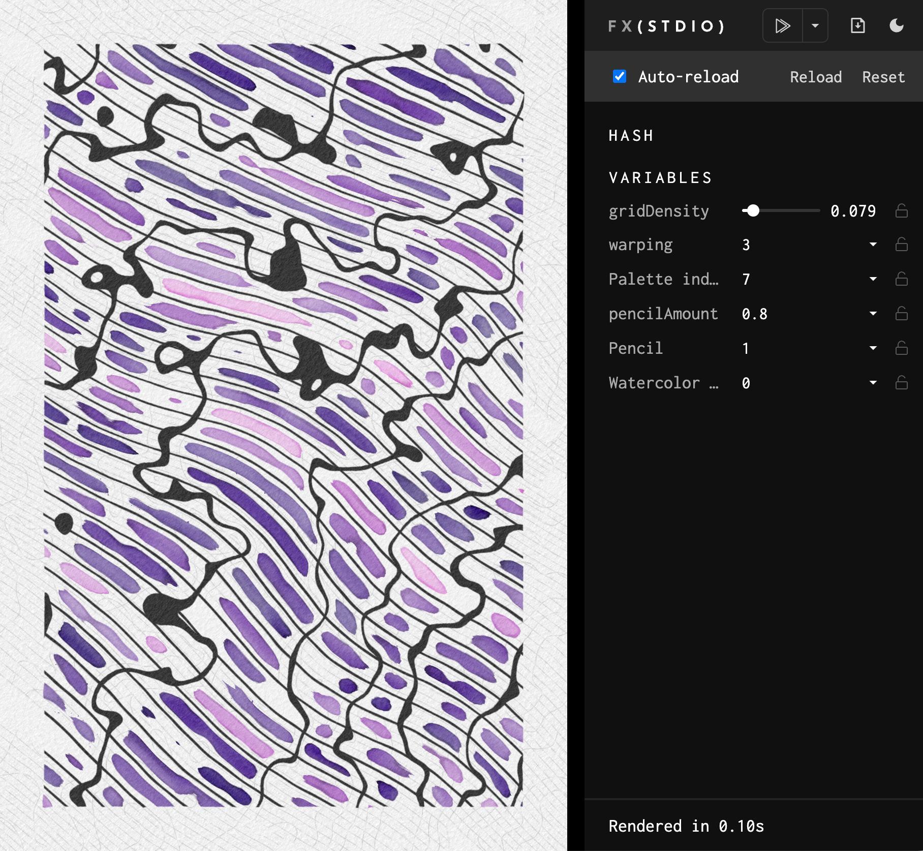
Our Tech Stack: fx(stdio), TypeScript, WebGL 2/GLSL 3...
Throughout the development of The Source, we found several tools to be invaluable:
- fx(stdio): This tool provided batch generation capabilities, randomness with variable settings, and a history of hashes, streamlining our workflow.
- TypeScript: We utilized TypeScript for enhanced code quality and developer productivity. Its static typing and modern language features ensured more reliable and maintainable code.
- WebGL 2/GLSL 3: Leveraging the power of WebGL 2 and GLSL 3, we created stunning visual effects and harnessed the full potential of the GPU for high-performance rendering.
- Webpack: We relied on Webpack to bundle and manage dependencies, optimizing the build process and enabling effective code modularization.
- Webpack-glsl-minify: This tool proved invaluable in minifying our GLSL code, reducing its size, and optimizing runtime performance.
- Vercel: We relied on Vercel for deployment, providing us with a seamless hosting solution that ensured our project was readily available to the public.
Additionally, we made use of various GLSL libraries:
- glsl-noise: A library providing noise functions for generating procedural textures and effects.
- glsl-random: A utility library for generating random numbers within GLSL shaders.
- glsl-hsl2rgb: A helper library for converting HSL (hue, saturation, lightness) color values to RGB (red, green, blue).
- glsl-aastep: A library for performing anti-aliasing calculations in GLSL shaders.
We also incorporated SDF (Signed Distance Function) code snippets from Inigo Quilez's website, which proved to be an invaluable resource for implementing various distance-based calculations and effects.
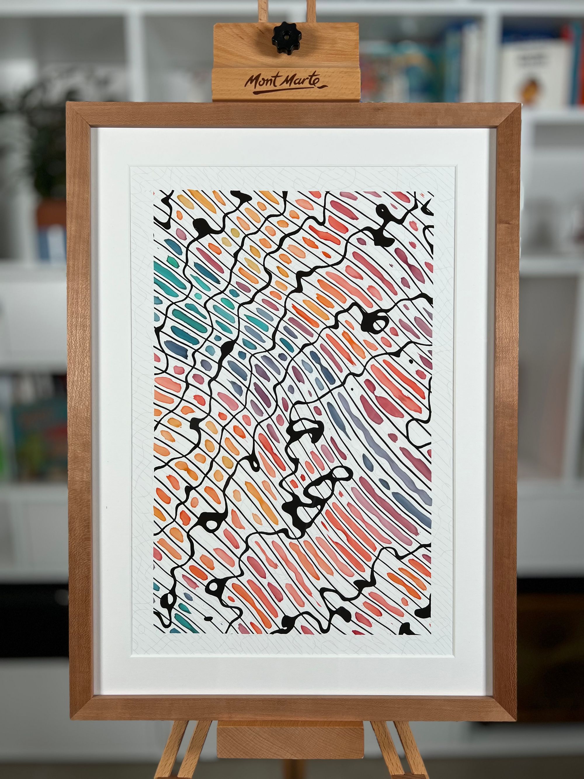
Perfecting the Print: Overcoming Challenges
Right from the start, we aimed for The Source to be printable. However, achieving an accurate print representation posed an additional challenge due to our emphasis on realism.
Printing a piece with the generated paper texture did not yield satisfactory results. As a solution, we opted to print the piece without the paper texture on a type of paper that closely matched the generated texture. This required finding a paper with a grain that closely resembled the desired texture.
The initial attempts did not produce the desired outcome, despite using an appropriate ICC profile. The pencil lines appeared too dark, the ink seemed too light, and the watercolor colors appeared too pale, among other issues.
To address these challenges, we went through multiple iterations, adjusting various parameters each time. We fine-tuned the brightness of the pencil lines and ink, the saturation of the watercolor colors, the paper size, weight, and type, among other factors.
Through this iterative process, we aimed to achieve optimal results, constantly refining and experimenting until we found the right balance. It required careful consideration and adjustment of various factors to ensure that the printed output accurately captured the essence and details of The Source.
The Source will be dropped on July 31st to gm.studio. For more information, please visit the project page and follow us on Twitter: @matthieuart & @camillerouxart.